


Rebranding a Nonprofit Theater: Top Tips and Examples
I didn’t catch the theater bug until my senior year of college and gosh I wish I would’ve discovered it sooner! I helped with tech for a few shows, then got to design the sets for The Music Man before graduation. It’s still one of my favorite shows!
There’s something magical that bonds theater kids together, even if you’re new to the obsession
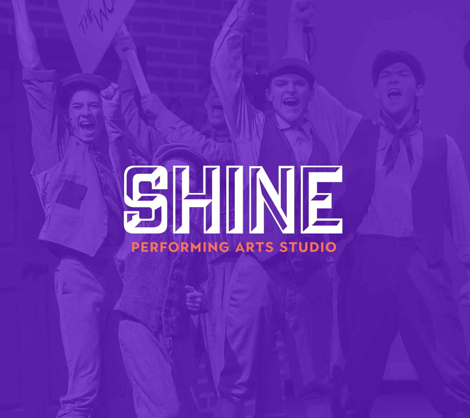
So, when I got to work on a brand and website refresh for Shine Performing Arts Studio, this design project felt extra special. These kids are über talented and they perform blockbuster productions – from classics like Phantom of the Opera to some of the freshest shows coming off Broadway like Finding Nemo Jr.
Shine had been experiencing steady success for their high-quality productions, but their brand felt a little too vanilla for the troupe.
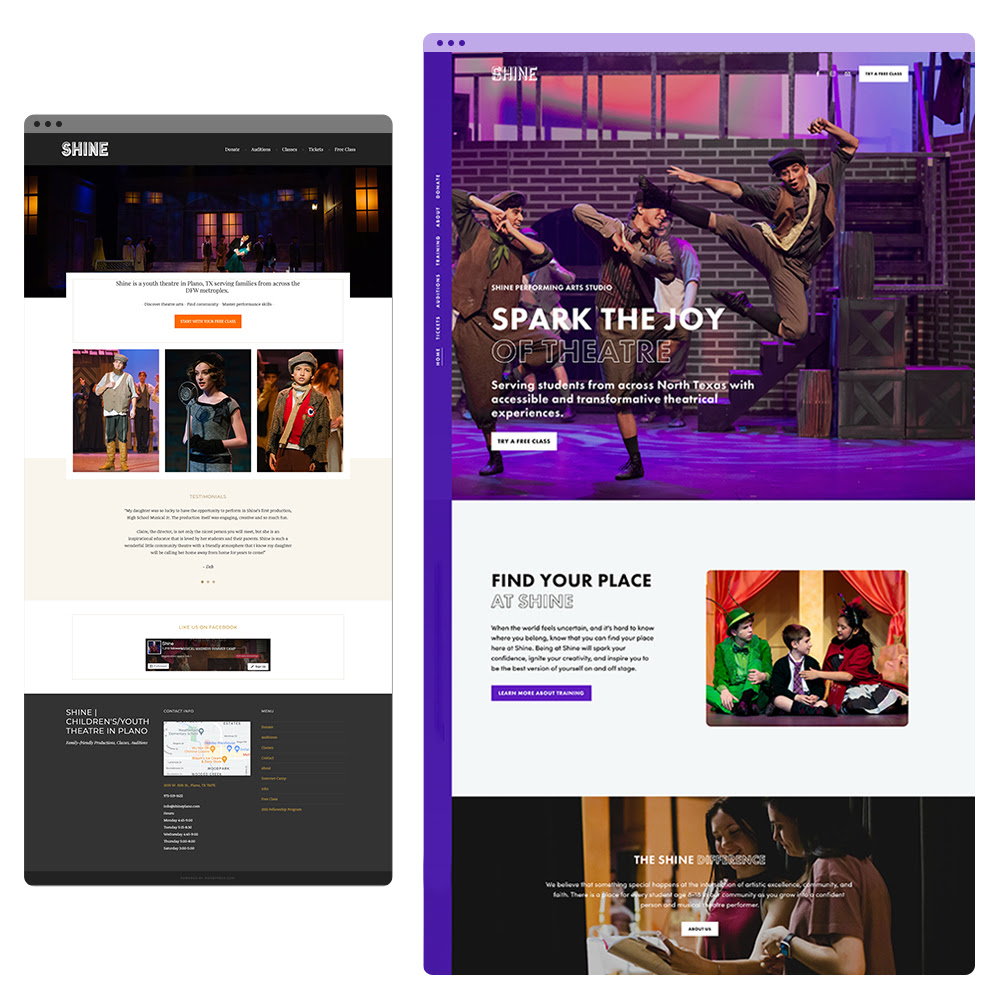
We cleaned up their logo, fonts, and colors, then applied the new style to an easy-to-update Squarespace website. Here’s a link to checkout the full case study, but the cherry on top was creating a series of bold new show posters Shine’s dynamic new look keeps people on their site longer and makes it easier for more people to book tickets and sign up for classes. And all of that traffic led to a 29.68% increase in online donations🎉.
Now, let’s delve into the practical side. Here are 3 takeaways from Shine’s success that you can apply to your own website:
Consistency matters: Even if your programs are high-quality and effective, a dated website can hinder how attractive your nonprofit is to new supporters. Visuals that align with your mission will subconsciously signal that your nonprofit is successful and worth investing time or money in.
Manage your main menu: Shine has a loyal following of parents and students who knew how to navigate the site, but their most-visited pages were buried. Think of your website’s homepage like the front door for new visitors, but your main navigation is a quick way for returning visitors to get to their most important content. You’ll need both to be effective!
Reduce friction for your users: Shine used three separate systems for donations, tickets, and classes, but wasn’t ready to switch their tech stack. So we styled each form to match the new website then embedded them onto the page. This helped the site feel more streamlined to the user and extended their time on the site.
It may be tough to quantify the value of branding, but Shine’s story is a good reminder that good design has a ripple effect.
If you’re considering a refresh, I’d love to chat about your goals and how we can help your organization shine online. Schedule a call to see if we’re a good fit for you!
Related Case Studies
For more examples of community-based nonprofit branding and audience engagement, explore these case studies:

Shine Performing Arts Studio
Texas youth theater, blending community, faith, and artistic excellence, shines with a polished new brand identity.Read More

The Marfan Foundation
An international community fighting genetic aortic and vascular conditions refreshed their website to carry them into the modern age.Read More


Comments +