


Americans around the country are gearing up, literally, for the red, white, and blue-est holiday of the year: Independence Day.
We dress kiddos and pups alike in the stars and stripes, all based on one iconic symbol:
Whether our nation’s flag makes you proud, angry, sad, nostalgic, or hopeful – symbols are powerful.
We attach identity and meaning to them, that’s why we use them in logo design.
The science behind it is even more incredible. It’s estimated that the human brain processes visuals much faster than text, like 60,000 times faster. That’s half of a second!
That’s why symbols and icons are crucial for making your nonprofit’s logo memorable and distinct.
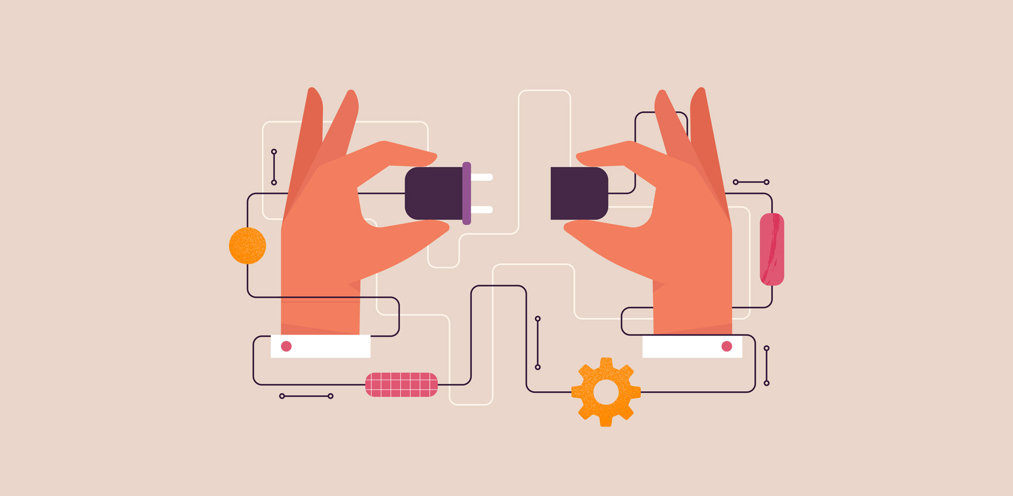
But you can also use icons to help connect people to important information:
- Icons transcend language barriers. For example, a well-designed restroom icon is understood anywhere in the world.
- Clear icons can simplify complicated information. Consider explaining your intake process, services, or programs with graphics in addition to bulleted text.
- Graphics guide the eye. On a webpage, people will view images first, then look at text for more context. Icons can quickly guide the eye to the information needed.
- Symbols with existing affiliations can evoke emotions. Think of the peace symbol or the heart icon used by charities.
Like cliché words, some icons are so overused in our sector that they’ve lost meaning. Here are some of the top offenders:
- Heart in hands: This icon always makes me chuckle because my heart has literally been in a surgeon’s hands. I know the idea is to show care and compassion, but how can we portray this in a new way?
- Coins: I think this subtly implies that nonprofits run on change or what’s left over, which we all know is not true. Plus, I doubt you accept your donations in coins.
- Globe: We all live on the planet, so a globe alone doesn’t really differentiate your nonprofit from anyone else.
If you’re still using one of these icons, take this as a creative challenge to extend beyond the cliche. Even the subject of HeartSpark’s icon could be considered cliche (heart and sparks) at first, but I’ve designed it in a fresh, modern way to make it sing.
Clear, consistent iconography will underscore your nonprofit’s core values and guide people to important information. Don’t underestimate their power!
Related Resources
For more insights on nonprofit branding and audience engagement, explore these articles:

Can Looking Good Actually Cost Your Nonprofit Donations?
For-profit companies and startups have an obsession with perception that has led to the idea of branding as a luxury…Read More

5 Essential Resources for Nonprofit Leaders
While the world seems to have hit pause during the COVID-19 outbreak, this is actually the perfect opportunity to sharpen…Read More


Comments +