


I just got back from 8 days cruising in the Caribbean 🌴
We traveled on Virgin Voyages, so you know my nerdy designer self was OBSESSED with all of the branded spaces on board.
Every restaurant, bar, and space had its own vibe. Virgin didn’t plaster their logo on everything, but it all felt excellent and cohesive.
Submarks and secondary logos are a complement to your main logo
A submark is a variation on your logo that still feels on-brand but can be used in specific instances. It’s a way to change up your logo, but still feel uniquely reflective of your mission. They’re versatile little versions of our main logo that we can use in all sorts of places – social media profiles, our website favicon, stationery, merchandise… you name it!
Your logo doesn’t have to do all the heavy lifting for your nonprofit – and shouldn’t be used everywhere and on everything. If your logo feels stale or overused, consider adding submarks to your brand identity to change it up while still staying on-brand.
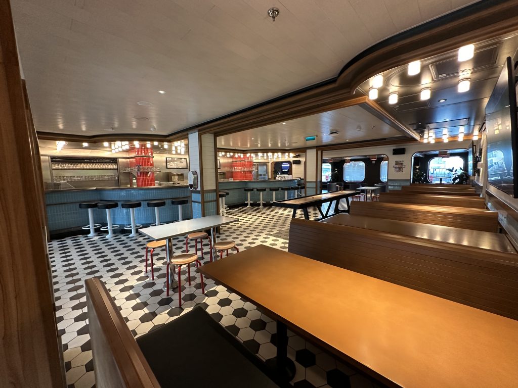
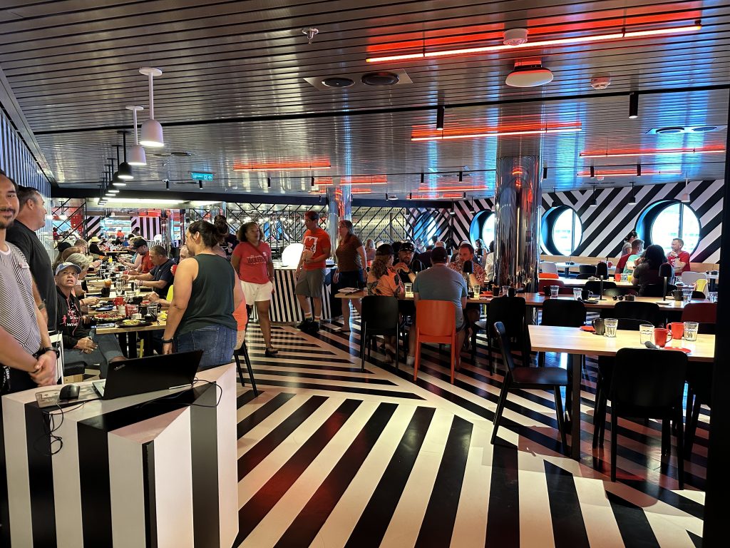
Virgin Voyages branding is on point
Every space on their Valiant Lady ship had an identifying name, distinct feel, and submark or secondary logo that still felt unique to Virgin Voyages. Although it all felt unique, every touch point was excellent and consistent. Even the emails leading up to our trip talked to our identity as “sailors” instead of customers. The cheeky language and pun-filled copywriting was a huge plus, offering moments to surprise and delight customers before you ever got on board. Additionally, they expertly used color to give their brand personality and purpose, ensuring a memorable and cohesive experience throughout the journey.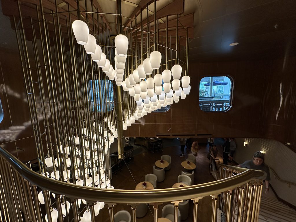
Although I know Virgin Voyages has millions of dollars to spend on branding and building a top-notch customer experience, there are some similar branding principles you can apply to your nonprofit.
Use submarks or secondary logos when…
-
- You feel stuck with one logo that’s plastered EVERYWHERE
-
- Your main logo doesn’t work on a small or large scale, or you need unique sizing
- You have a strong brand and want to tap into recognition without saturation
- Branding your monthly giving program or a group of supporters at different donation circles
- Your programs serve varied audiences, i.e. appealing to youth vs. adults vs. seniors
Submarks are one of the biggest logo design secrets no one talks about in our sector because the idea of “consistency” has been drilled into our heads for too long, when they actually can help your brand stand out.
Nonprofit submark example: Covered
It’s solid and works at a small size, but because it’s so horizontal it doesn’t work very well in layouts like a social media profile icon or in an email signature.
So I created submarks to work with this logo, yet still feel like the Covered brand. Here’s what they look like:

Read the full Covered branding case study.
How and where to use submarks depends on your audience touchpoints
If your brand doesn’t have submarks right now, then consider where they could be helpful for you. By building off your current logo design you’ll save time and budget on a full redesign, but can look more polished by strategically using logos that fit specific space or purpose.
Your one-size-fits-all logo may not work well in:
-
- Website navigation: When you use the same logo that has an icon and tagline in it on social media, it’s too small to read in the main navigation.
-
- Social media profiles: Most logos don’t resize to a square or circle crop very well, which can make your profile look unprofessional. Since your nonprofit’s name is right next to the image, use this opportunity to use your icon or brand color in the profile picture.
-
- Merch: Generally, people don’t merchandise with just a logo. Use your brand tagline or style a pithy statement to print on a t-shirt or bag. It’s way cooler and will generate more interest and sales!
Remember, your submarks should reflect your brand personality and feel like an extension of your existing style. These logos can also help inspire a cleaner take on logos for your programs or campaigns. It’s okay to let your nonprofit’s hair down and have some fun with it!
I’m buzzing with ideas on how submarks can be incorporated into nonprofit branding, but what do you think? Where do you see opportunities for a submark to add that extra bit of joy and recognition to your brand presence?
Schedule a Call with LaurenRelated Resources
For more insights on nonprofit branding and audience engagement, explore these articles:
Nonprofit Logo Costs: From Templates to Agencies
Learn the differences between templates, graphic designers, studios, agencies, and what’s included at each price point and find the right…Read More
Mastering Visual Communication: Create Effective Style Boards
Struggling to convey your design ideas? Create effective style boards with our 3-step process. Discover tips for selecting keywords, organizing…Read More


Comments +