


I hate the word “professional.”
For me, it conjures up stock images of blue suits and cheesy grins and handshakes – or worse, having to clock in at a specific time every day and sit in a cubicle till dusk. Maybe it’s trauma from my days gone by in the corporate world *shudder*
However, reading between the lines, for most nonprofits “professional and polished” means wanting their style to look complete and consistent. It’s not about posing like a professional corporation – it’s about looking credible and consistent.
A “professional” nonprofit that works with youth has a different set of graphics to play with than an organization that focuses on building homes for people in need. Both can look and feel professional, even though they present differently.The key to getting this right is to lean into your mission. People are looking for visual cues to back up what you claim. And these visual “hints” are interpreted without someone even thinking about it.
Enter: lines and doodles
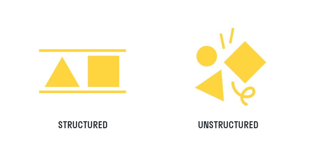
Visual designs (e.g. fonts, shapes, organization of content) can feel either structured (e.g. straight lines and stable shapes) or unstructured (e.g. irregular shapes and doodles).
A 2022 study tested this theory with perfume bottle shapes and found that “perfume ads that matched its described positioning received up to 25-39% higher clicks.”
Consistent design – not “professional” design – is actually most effective.
Let’s test this in action: Look at your mission statement and circle the verbs.
If your mission claims to build, organize, or educate, add more straight lines or steady shapes (squares or triangles) to your designs. Horizontal lines signal stability and structure while vertical lines signal strength and confidence.In the same way, when you say you’re fun, dynamic, or innovative – try adding some doodles or rotated shapes to your designs.
This can be a tough call for the board or those who want to stay conventionally “professional,” but now you have proof to show them it’ll actually help how people perceive your brand Now, of course, with any design elements, styles exist on a spectrum.
Your mission may contain a mix of verbs that call for structure and play. And that’s where there’s room for a mix of both in the visuals.
Need to borrow some courage to embrace the doodles? Check out the WareHouse of Venice’s website – leaning into this theory has led to new local business partnerships, increased credibility, and more donations. Plus, a more “fun” brand style for the youth they serve!
P.S. Forget looking “professional” in the traditional sense. Whether your nonprofit claims to be effective and reliable or fun and innovative, people are looking for visual cues to confirm that you are who you say you are. Structured designs (straight lines or shapes) or unstructured designs (doodles, rotated shapes, or bright colors) support those claims.
Schedule a Call with Lauren
Related Resources
For more strategies on enhancing your nonprofit’s appeal and branding:

Can Looking Good Actually Cost Your Nonprofit Donations?
For-profit companies and startups have an obsession with perception that has led to the idea of branding as a luxury…Read More

Does branding really matter for nonprofits?
The line is starting to blur between social impact and nonprofit sectors. People are supporting businesses that give back to…Read More


Comments +