


There are over 1.5 million registered nonprofit organizations in the United States. On average, around 50,000-60,000 new nonprofit organizations are registered in the United States each year.
It’s not enough to be a nonprofit or charity anymore – your nonprofit needs to stand out to survive and grow.
But the best brands aren’t just about having a great logo – they’re about telling a story, standing out in a crowded space, and connecting with their audience on a deeper level. But what truly sets the best nonprofit brands apart?
When evaluating the best nonprofit brands, it’s not enough to look at aesthetics alone. The most effective brands excel in three critical areas: positioning, brand identity, and messaging.
In this article, I’ll spotlight ten up-and-coming nonprofits that are redefining what it means to build a powerful brand in a short amount of time. With most of these brands under a decade old, they demonstrate how intentional branding can set the stage for success. How do they do it? I’ll clue you in and share how these nonprofits masterfully leverage 3 elements – positioning, brand identity and message – to make an impact.
How to Determine the Best Nonprofit Brands
I look at the “best” nonprofit brands through three lenses: positioning, brand identity, and messaging. To make things clearer, here are brief descriptions of these essential elements of a nonprofit’s brand:
- Positioning: Determines how your organization stands out in the marketplace
- Brand identity: Shapes the visual and emotional impact of your organization
- Message: Crafts the narrative that resonates with your supporters
All three aspects of your nonprofit’s brand shape your public-facing website. So for the purposes of these examples, I’ll be reviewing each organization’s website as the main reference point.
This review is in no way a dig on brands not shared here, nor is it an attempt to take credit for these creatives and their outstanding work. Creative credit is listed below each featured organization, so if you like what you see, click to see more of their work or get in touch!
Top 10 Nonprofit Branding Examples for Up-and-Comers:
When it comes to nonprofit branding, there are the obvious organizations that are always mentioned like charity:water, Girl Scouts of America, or World Wildlife Fund. But instead of writing another praise-filled case study on these well-known brands, I want to highlight 10 nonprofit organizations that are building strong, consistent brands.
All of these organizations are fairly new to the nonprofit sector, serve a very local market or specific niche, have an outstanding visual brand identity, and are sharing their impact with clear messaging.
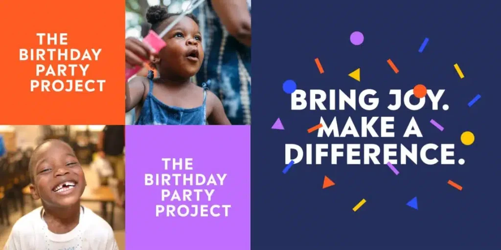
1. Human Services: The Birthday Party Project
- Founded: 2013
- Positioning:
- Community-minded organization
- Fosters hope, happiness and sense of belonging by throwing birthday celebrations for children experiencing homelessness
- Aims to relieve some of the mental health effects children experience from lack of stable housing
- Visual Identity: Branding balances the seriousness of the mission with a celebratory tone, allowing the organization to lean into either emotion as needed.
- Confetti adds subtle movement to logo
- Bright, clear colors
- Letters in all caps create stability and seriousness
- Understated logo and graphics keep focus on the colorful photos of birthday kids
- Message: “Bringing joy to children experiencing homelessness through the MAGIC of a birthday celebration.”
- Clear and straightforward messaging
- Use of ALL CAPS and exclamation points is measured, not excessive
- Enthusiastic voice is reserved for recruiting volunteers and “birthday enthusiasts” to maintain appropriate tone
- Clear calls to action: get involved by funding specific party supplies, volunteering for the local community, or advocating as a birthday enthusiast
- Branding Agency: Tegan Digital

2. Arts & Culture: SHINE Performing Arts Studio
- Founded: 2015
- Positioning:
- Serves youth in Plano, Texas by nurturing creativity, discipline and passion for the performing arts
- Empowers young people to express themselves confidently on stage and in life
- Visual Identity: Branding expresses energy and definition to reflect the excellence, excitement and youthfulness of this performing arts community.
- Bold and energetic color palette reflects spirit of young thespians
- Dimensional lettering features sharp finish with inspiration drawn from display boards on Broadway
- Big impact from clear, bright pictures that capture the exceptional production quality and emotion of SHINE actors
- Message: Theatre has the power to spark joy and provide a lifelong community that can transform a child’s life for the better.
- Unique call to action: “Join a free class” is more prominent than ‘donate’ or ‘volunteer’ to demonstrate focus on serving students
- Branding Agency: HeartSpark Design
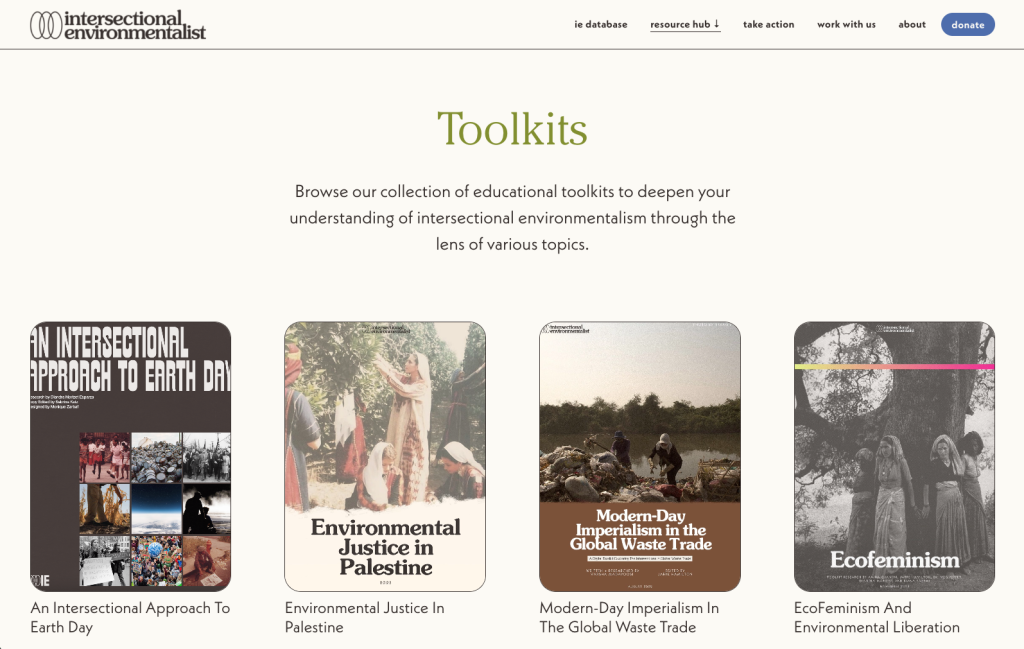
3. Environment: Intersectional Environmentalist
- Founded: 2020
- Positioning:
- Advocates for environmental justice and ecological activism that is inclusive, equitable, and just for all
- Educates on the intersection of social and environmental issues
- Centers on marginalized communities and amplifies diverse voices in fight against climate change
- Visual Identity: Adopts the Champion brand personality to showcase slapdash grit while keeping an inclusive logo that’s open for interpretation and able to flex for various topics and services.
- Understated color palette
- Brutalist-style iconography
- Polished appearance that isn’t trying too hard
- Retro style speaks to Gen Z audience
- Illustrations and graphics lean into style over time for a sustainable brand identity
- Message: Abundant clarity about who they’re for and how to get involved.
- Straightforward, strictly business, not overly cute.
- No-nonsense brand voice. For example, a database is called a database; a resource hub is exactly what you’d expect.
- Brand Designer: Farrah B. Fox
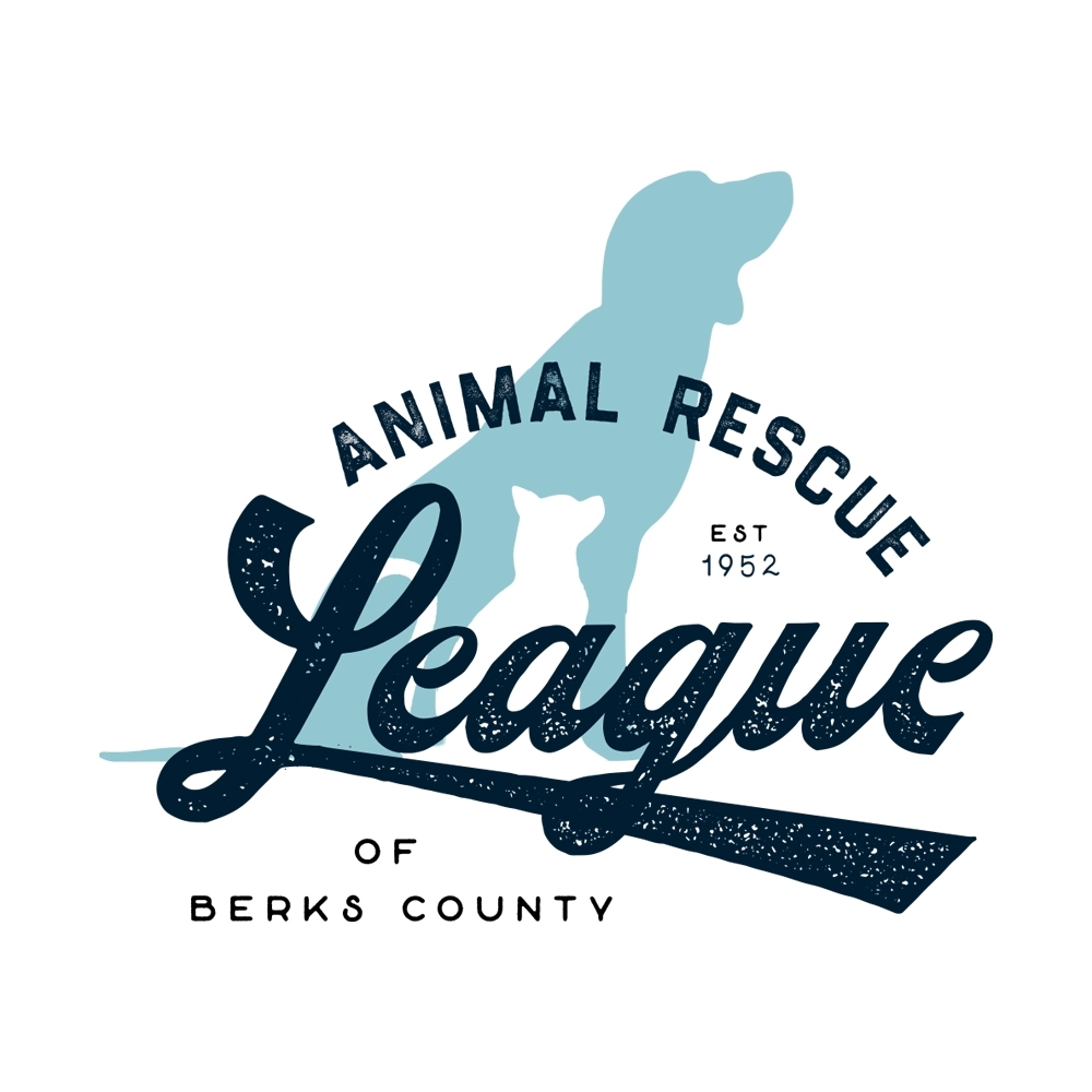
4. Animal Welfare: Animal Rescue of Berks County
- Founded: 1952, rebranded in 2021
- Positioning:
- Provides compassionate care, rehabilitation, and adoption services for homeless and abused animals in Berks County
- Advocates for responsible pet ownership and humane treatment
- Visual Identity: Embraces the Companion brand personality to rally community with a hometown feel.
- Feel-good color palette and eclectic fonts
- Playful style with consistent feel
- Message: Happiness, kindness and community.
- The presentation deck featured mockups that inspired staff to have fun and get creative with new logo and merch. This brand refresh reminds us that you can teach an old nonprofit new tricks!
- Branding Agency: Paper Laundry
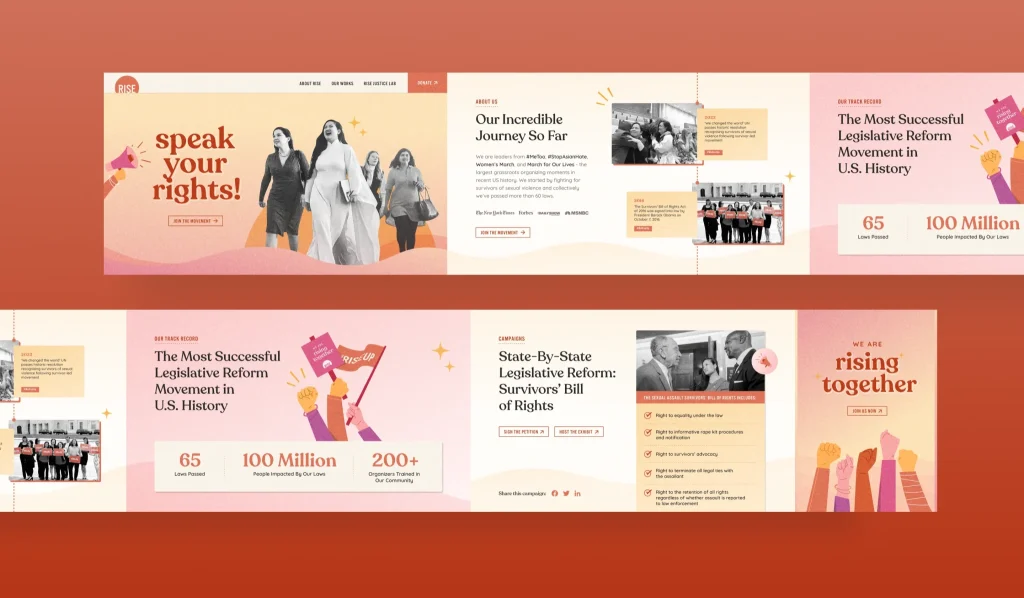
5. Civil Rights: Rise
- Founded: 2014
- Positioning:
- Advocates for sexual assault survivors through legislative reform
- Ensures survivors have a voice and civil rights are protected under the law
- Visual Identity: Hope and strength.
- Subtle animation and video
- Rising elements bring life and lift content while scrolling through page
- Fonts and colors blend strength and softness
- Message:
- Clear calls to action
- Uniquely addresses the gap through language of helping people “pen their own civil rights into existence”
- Website Designer: Brave

6. STEM Education: Her Spark
- Founded: 2008
- Positioning:
- Empowers young women to explore interests and careers in STEM
- Provides hands-on learning, mentorship, and community support to the next generation of female innovators (grades 6-12)
- Visual Identity: Strong, feminine and fun, appealing to teenage girls.
- Purple and green color palette remains key differentiator while keeping consistency with original branding
- Strong, geometric shapes
- Touches of organic lines and accents
- Blended style feels fun but not flighty, feminine but not girly, strong but not unfriendly
- Great example of how to tune up existing elements for a new look that still feels like your brand
- Message: Students should be able to imagine themselves in the program without feeling put off by messaging that’s too techy.
- Clear and professional language
- Uplifting tone
- Appeals to both teen girls and their parents
- Branding Agency: HeartSpark Design
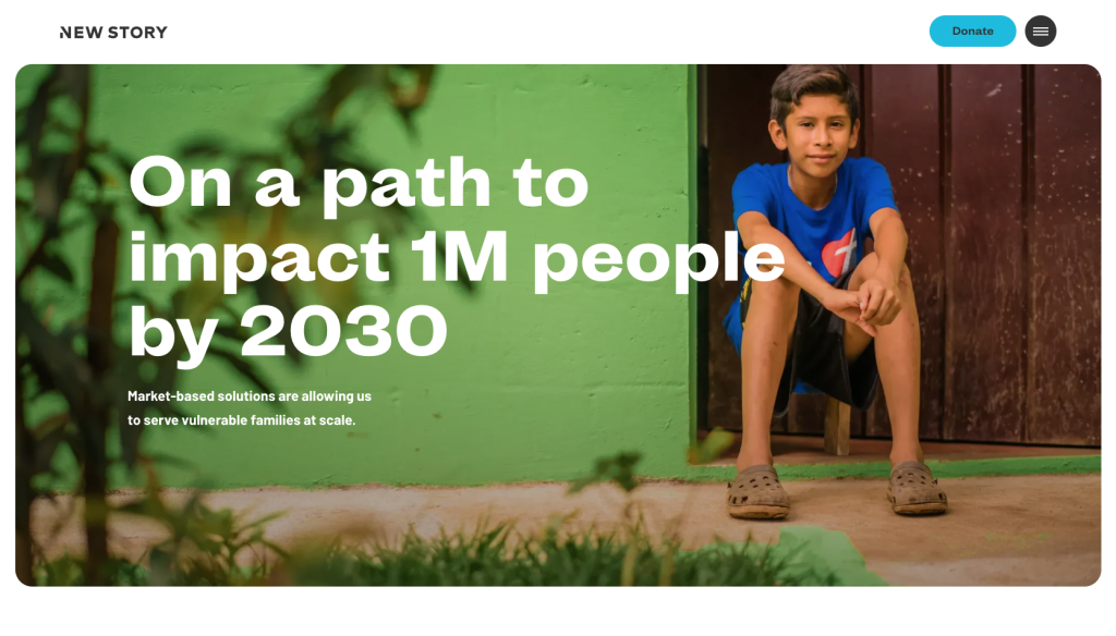
7. Global Housing: New Story
- Founded: 2014
- Positioning:
- Aims to transform global housing crisis
- Builds safe, affordable homes for families in need
- Leverages cutting-edge technology, sustainable practices, and local partnerships
- Visual Identity:
- Photography used consistently for impactful storytelling
- Simple design elements for effective user experience
- Bright teal blue color connects text and images across pages
- Minimalist design inspires creativity
- Message: Clarity in what they do, where they do it, and what goals they have for the future.
- Website speaks directly to new supporters and donors
- Impact page is specific and descriptive
- Includes statistics
- Clearly outlines Theory of Change
- Features great stories
- Website Designer: Whiteboard
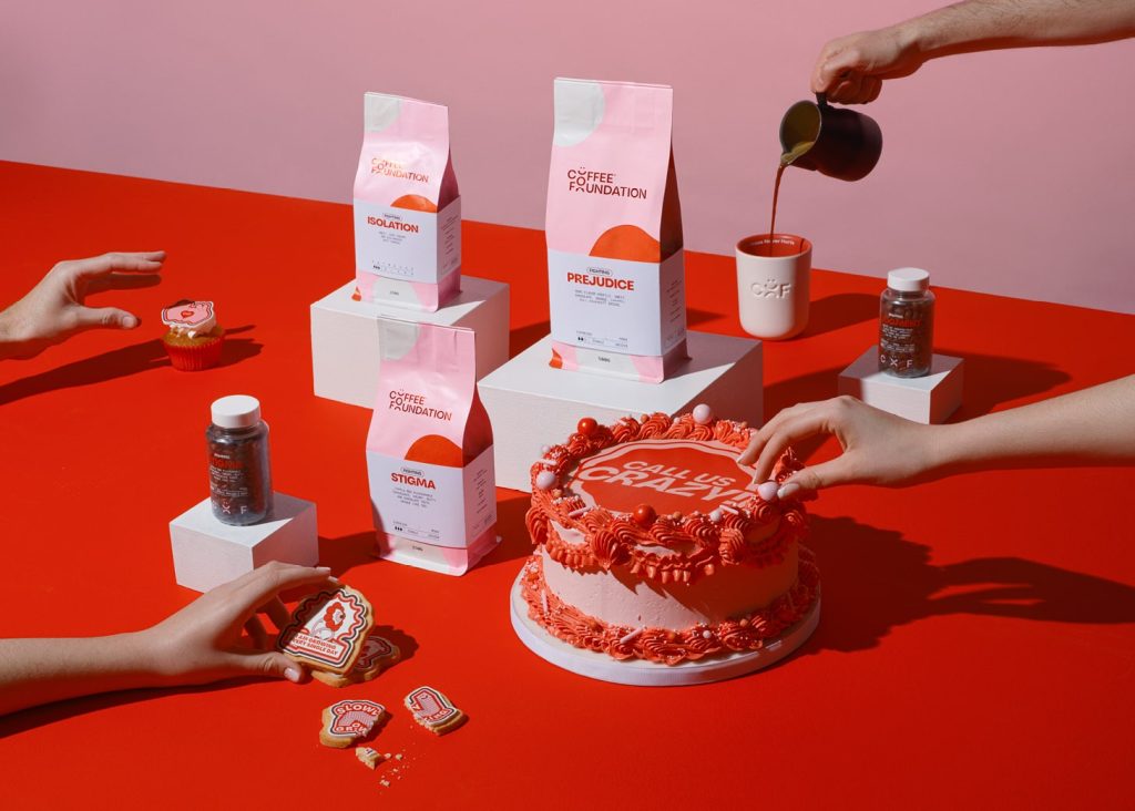
8. Mental Health: Coffee Foundation
- Founded: 2024
- Positioning:
- Bridges coffee craze with breaking mental health stigmas
- Unique founder story
- Room for improvement: Could be clearer about how they’re breaking stigmas – “more than a brand, a movement” is something that every company or nonprofit could say!
- Visual Identity: Only the Jokesters can tackle a serious topic with these unconventional visual cues!
- Bold and playful design for fresh spin on ‘coffee shop’ vibe
- Red and pink color combo adds energy and humanity to brand personality
- Smile and rounded shapes bring playfulness and optimism, boosting approachability
- Kickass illustrations communicate ideas and add subtle wink of personality
- Message: Brand personality and voice seep through all aspects of the Coffee Foundation’s messaging.
- Creative merch: “fighting” specialty coffee, branded coffee beans
- Brand Designers: Andrea Flemma and Paolo Vendramini
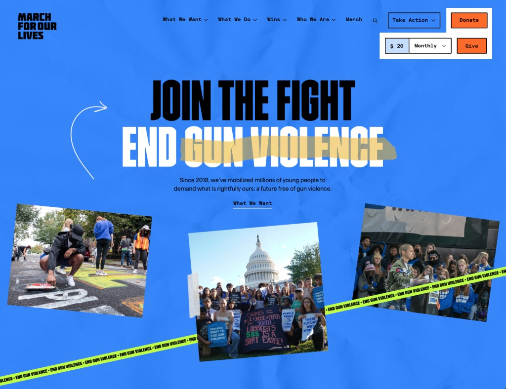
9. Gun Control: March for Our Lives
- Founded: 2018
- Positioning:
- Formed in response to Parkland school shooting
- Advocates for gun control and policies to prevent gun violence
- Engages young people in activism and public policy
- Visual Identity: Optimistic, yet uncompromising.
- COLOR! Instead of skewing more serious, their colorful palette speaks to steadiness (true blue) with energetic colors like neon green and yellow
- Bold, condensed fonts in all caps signify strength
- Hand drawn lines soften the message and direct attention
- Message: Strong, assertive, and liberating – the Rebel personality that unapologetically challenges the status quo.
- Name and headlines are immediate and collaborative
- Calls to action are directly addressed to you, the reader
- “Be anything but patient. Act now.” Copy reflects clarity, conviction and urgency – zero fluff, all action!

10. Health & Chronic Illness: CoachArt
- Founded: 2001
- Positioning: One of the few nonprofits integrating their work at scale, with an app that allows students to get matched with coaches.
- Serves children living with chronic illness
- Provides free, personalized lessons in the arts and athletics
- One-on-one coaching and community programs
- Visual Identity: CoachArt’s new brand is a good reminder that you can build on your existing logo and still revolutionize your design style.
- Color palette and font pairings highlight mission
- User-generated photography
- Illustrations and photo frames create consistency
- Message: Rotating messages inspire children to see the possibilities.
- Home Page structured like Product Page
- Message rotates with talents
- Videos and illustrations demonstrate possibilities for parents
- Featured partner logos and awards build trust by qualifying safety and security of programs
- Branding Agency: HeartSpark Design
5 Recurring Themes with the Best Nonprofit Brands
The nonprofit brands listed above may be new to the sector, but they’re experiencing rapid growth, and I think that’s a direct reflection of their approach to branding their missions. The best nonprofit brands have these 5 things in common, and I’m sure they can be helpful as you build your nonprofit brand, too.
- Know Your Market: Understand your unique position in the larger systemic issue. For nonprofits, your positioning is most likely directly linked to your founding story, and it informs your brand identity and messaging. A clear, well-defined mission that resonates with your target audience is key. Whether your focus is local or global, positioning your organization with purpose helps build trust and connection with those who matter most.
- Bold Personalities: Don’t shy away from showcasing your organization’s unique personality. Use bold, memorable visuals and a distinct voice that reflects your mission. Whether playful, challenging or somewhere in between, a strong brand personality helps your nonprofit stand out and engage supporters.
- Emotional Resonance: These brands are adept at tapping into the emotions of their communities. Whether it’s the joy and hope instilled by The Birthday Party Project or the urgency and empowerment conveyed by Rise, they create a strong emotional connection that drives support and is underscored by their brand identity and messaging.
- Invest in a Creative Advisor: Hiring skilled designers and branding experts can elevate your visual identity and messaging. Professional, cohesive branding – from your logo to your website – ensures consistency across all platforms and makes a lasting impression. Plus, you can ask a professional to train you how to use your new brand so you understand what makes certain graphics or wording better than others.
- Community-Centered Approach: Finally, these organizations place a strong emphasis on community, whether it’s building a sense of belonging among supporters, like SHINE Performing Arts Studio, or creating a movement for change, like Intersectional Environmentalist. Their brands are not just about the organization but about being the bridge between the people and causes they serve, making them more inclusive and impactful. At HeartSpark, we call this building a shared sense of identity – and it’s built intentionally and consistently over time.
The rapid growth of these nonprofit brands – most of them just in existence for 10 years or less – is a testament to the power of intentional and strategic branding. By understanding your market, embracing a bold personality, fostering emotional resonance, investing in creative expertise, and centering your community, your nonprofit can build a brand that not only stands out but also deeply connects with those you aim to serve.
Remember, branding isn’t just about visuals or messaging – it’s about creating a shared identity that resonates with your mission and inspires action. As you build your nonprofit brand, keep these principles in mind to create a lasting and meaningful impact.
A New Wave of Nonprofit Branding
The standard for nonprofits to look outdated or “needy” in order to get support are over. The way of the future – as these amazing nonprofit brands demonstrate – is that there is more growth to be had in establishing a clear market positioning, bold visual brand, and clear messaging that resonate with your current donors and attract new supporters.
If you’re ready to join the new school of thinking around nonprofit branding, schedule a call today to discuss how we can level up your brand!

Comments +