Children Striving Together

Fresh take on an after-school program for at-promise youth.
About Children Striving Together

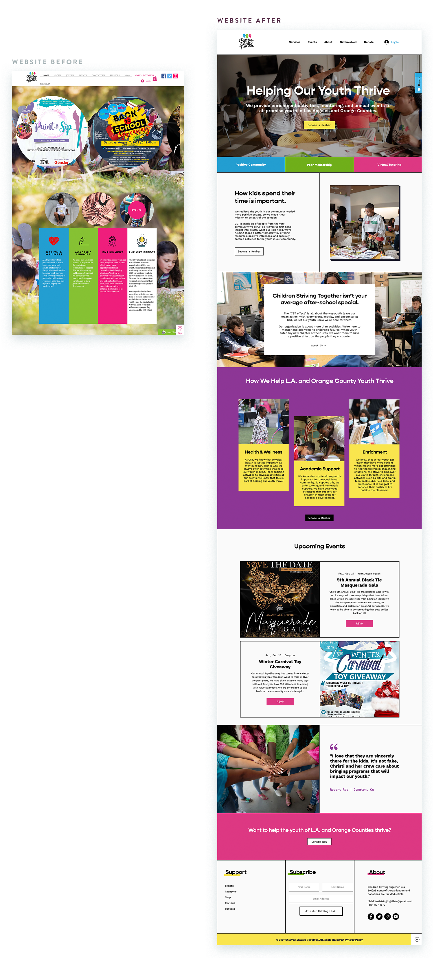
Serving Los Angeles and Orange Counties since 2011, Children Striving Together has a strong reputation for supporting youth and their families with positive outlets. They had been doing good work in Compton for years, but their brand desperately needed an evolution. They were looking for a fresh take on their program to help propel their nonprofit into the next phase of development and growth.

Visual Identity

Keeping their logo intact, we developed the Children Striving Together style around their sassy logo and bold color palette, reflecting the brazen spirit and bright futures of the students they serve. This incomparable organization deserved a unique, unapologetic brand style that felt true to their generous heart, dedication to mentorship, and love for the at-promise youth they serve. 

The modern style is underscored by the uncompromising reverse-serif Gopher font family and the hard-working duo of Work Sans and Roboto Mono. 

Children Striving Together is dedicated to serving youth of all ages and walks of life, so we wanted the design to be gender-neutral, appealing to youth between the ages of 9-14. The brand also had to have enough variety in style to skew to Juniors and Seniors in high school, if needed. 

Voice & Tone

CST primarily serves parents, educators, and kids — so getting the important points across in an engaging, youthful way became key. To make this happen, we wanted to avoid sounding stuffy or overly educational. Instead, the CST voice would feel friendly, fun and relational – without coming across as cheesy. After all, the end goal was not just to have folks clicking through the site, but to have them sincerely interacting with the content in a way that drives participation and involvement.

Additionally, word choice played a large part in the copy and its contribution to the essence of CST’s voice and mission. Traditionally, the core demographic served has been referred to as “at-risk” youth. Working closely with the client, it became apparent that  alternative phrasing would echo the vision of the CST community more effectively.  Reflecting unique value and tone, word choice was something we were mindful of throughout the process.

“I loved the knowledge Lauren had and how she really seemed to be vested in what we do for the youth. Our site traffic increased and we continuously receive amazing comments on our website.”

Christi McDaniel
Founder of Children Striving Together

Website Redesign

The new ChildrenStrivingTogether.org is built to make the registration process for students and families as seamless as possible. We cleaned up the sitemap, consolidated pages where necessary, and kept each page as straightforward and interactive as possible. CST had a great archive of event photography, so we wanted those stories (and fun!) to speak the loudest. 

Working with Dana Snyder at Positive Equation, Children Striving Together also installed the Fundraise Up platform to make donations even easier to receive.

Children Striving Together’s new visual identity gives them a foundational, timeless style to stand on and visual language to expand on as they continue to grow and serve at-promise youth. They’re proof positive that when a nonprofit dedicates itself to serving one community, it can have even more fun with a bold, unconventional brand style that will attract others who are ready to join forces for good.

Award-Winning Website

18th Annual Davey Awards Silver Winner
Community

Goals & Results

In February 2022, Children Striving Together was chosen to represent Compton as one of 44 local grantees of Nike, Inc.’s 2022 Black Community Commitment (#GivingBlack). Nike, Inc. selected organizations in various cities where their employees live and work to bring deeper connection with local communities.

141% increase in event page views
294% increase in unique website visitors
4X increase in recurring donations

Lauren Atherton
Creative Direction

Erica Buehler
Copywriter

Aleona Pollauf
Graphic Design

Brand Refresh

Website Redesign (Wix)

Children & Youth

Education

September 2021

Similar Case Studies

Bringing mindfulness to Fairfield County with a refreshed brand style and upgraded Squarespace website.
Honoring 60 years of I/DD services with a brand and website centered around community and built for the
Denver’s beloved learning institution grew community involvement by refreshing its brand identity and marketing strategy.
Radio Categories
Branding and marketing are often lumped together, but they serve two very different purposes. In this post, you’ll learn the real difference between branding and marketing, why the order matters, and how to set your organization up for more powerful, consistent, and aligned communications.
If talking about your nonprofit feels confusing or unclear, you’re not alone. The SPARK Strategy is a simple, powerful framework to help you confidently communicate your mission, connect with the right people, and inspire more support. In this post, I’ll walk you through exactly how it works and how to get started.
This post breaks down 5 smart strategies to help you build a great nonprofit website, guide visitors to action, and feel proud of how your nonprofit is being shared online.
In this post, I’m sharing the best (and worst!) times to rebrand your nonprofit. Plus how to plan around a milestone events, anniversary, and capital campaigns without overwhelming your team.
If your nonprofit website feels outdated or isn’t converting visitors into donors, these 3 simple fixes can start turning it around. Learn how to turn your site into a fundraising asset today.
If your fundraising feels harder than it should, your brand might be quietly working against you. Watch this quick video to learn how the right brand can help more of the right donors find YOU instead of chasing them.

Stay in the Loop

Get helpful insights, tips, and news delivered right to your inbox.